





How to Coordinate Bedding and Drapery in Style
A luxury bedroom feels considered when its layers speak to one another without looking copied. Bedding establishes the room's tactile center, while drapery extends its palette and visual weight toward the windows. The goal is connection, not a matched set.
To understand how to coordinate bedding and drapery, begin with one shared color family, then vary texture, scale, and pattern so each layer has a distinct role. Repeat one or two visual details, such as linen texture, velvet depth, or an embroidery motif, to create rhythm without making the room feel busy.
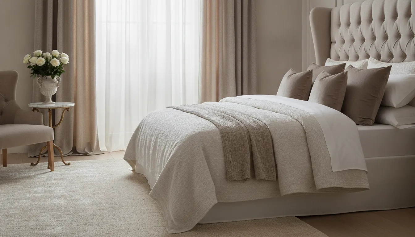
The most polished combinations usually start with a restrained palette and build through tonal variation. From there, the relationship between the bed and windows becomes easier to refine, whether the room calls for European-inspired softness, modern contrast, or a more opulent finish.
How to Coordinate Bedding and Drapery Around a Shared Palette
Begin with a palette, not a matching set. Choose one anchor color that can appear across the bed and windows, then let each category interpret it differently. An ivory bedroom, for example, might pair warm ivory bedding with drapery in a slightly deeper oat or a pale stone. The relationship feels intentional, while the subtle shift keeps the room from looking flat or overly coordinated.
This tonal approach works particularly well with Lili Alessandra's blend of European-inspired elegance and modern, fashion-forward sensibility. Think of the room as a composition of related notes rather than a collection of identical fabrics. If the bedding carries a soft blue-gray, drapery might repeat that color in a muted mineral tone, while a secondary shade such as taupe, ivory, or charcoal creates definition around the windows.
Choose one anchor, then build outward
Identify the textile or architectural feature that deserves visual priority. It may be a richly colored coverlet, an embroidered pillow, a statement headboard, or the natural light at the window. Use that element to establish the anchor color. Repeat the color at least once in the opposite category, but avoid copying its exact shade and placement. Bedding can hold the strongest expression, while drapery echoes it more quietly through a border, woven ground, or tonal field.
When the palette is pale, contrast can come from temperature. Pair warm ivory with mushroom, sand, or muted bronze rather than introducing a bright white that makes the layers feel disconnected. For deeper bedding, softened drapery tones can preserve lightness and prevent the windows from competing with the bed. For further guidance on selecting the window layer, explore luxury drapery panels for bedrooms.
Let texture complete the color relationship
Once the tonal palette feels balanced, use texture to distinguish the categories. A smooth cotton or sateen bed can sit comfortably beside softly structured panels, while a more decorative bed benefits from quieter window fabric. The colors stay connected, but changes in surface and scale give the eye somewhere to travel. If you are working with a light palette, these ivory bedding palette ideas offer a useful direction for keeping the room refined without making every layer identical.
Should Drapes Match Bedding? Use Color Relationships Instead
Should drapes match bedding? No. A bedroom usually feels more considered when the two layers relate without becoming an exact set. The most successful approach is to choose one anchor color, introduce neighboring tones, and then add a controlled contrast that gives the room dimension.
Begin with one anchor color
Choose a shade that already has visual authority in the room. It might come from the duvet, a coverlet, an upholstered bed, or a decorative pillow. Repeat that color in the drapery in a measured way, such as a related undertone, border, or woven detail. Ivory bedding, for example, can connect with drapes in warm sand, pale taupe, or a softened mushroom tone without making the windows look identical to the bed. For more direction, explore these ivory bedding palette ideas.
Use adjacent tones to soften the transition
Adjacent hues create continuity while preserving distinction. Pair cool blue-gray bedding with mist, slate, or muted blue drapery. For warmer rooms, layer champagne, camel, and restrained terracotta rather than repeating one exact beige. This tonal method suits Lili Alessandra's European-inspired elegance and modern, fashion-forward sensibility. It also gives linen, jacquard, cotton, or velvet room to show its character instead of letting color do all the work.
Add contrast with intention
Contrast should clarify the room's focal point, not compete with it. If the bedding carries an ornate pattern or rich embroidery, keep the drapery quieter and let its tone support the bed. If the bed is primarily tonal, a deeper drapery shade can frame the architecture and create welcome definition. Think of the window treatment as a companion layer, not a duplicate. The guide to luxury drapery panels for bedrooms can help refine that choice, while these upholstered bed styling ideas offer another way to assess the bed's visual weight before selecting a window color.
Build Contrast With Texture, Sheen, and Material
Texture gives a coordinated bedroom its depth. When bedding and drapery share the same finish, the room can feel flat, even when the colors are beautiful. A more refined approach is to let each textile contribute a different surface quality while keeping the overall palette connected.
Begin with a matte foundation, such as stonewashed linen, cotton, or a softly quilted coverlet. These materials create a relaxed visual field that allows more dimensional pieces to stand out. Across the bed, a velvet accent or jacquard weave can introduce depth without requiring a new color. A subtle sheen from embroidered silk can then catch the light on a pillow or folded layer, creating a quiet focal point rather than a glossy effect throughout the room.
The same principle works at the window. If the bedding has a pronounced weave, consider drapery with a smoother hand or restrained luster. If the bed is composed of polished cotton or silk details, a more tactile window treatment can balance it. The goal is not to make the materials identical. It is to repeat one quality, such as softness, texture, or gentle reflection, while allowing the neighboring layer to provide contrast.
Combine tactile layers with restraint
Material variety is most successful when each textile has a clear role. Bamboo or Tencel can contribute a smooth, contemporary note alongside the more visible structure of basketweave. Quilting and embroidery add relief, especially when used on a coverlet or decorative pillow rather than repeated across every surface. A velvet throw can supply concentrated richness at the foot of the bed, while cotton or linen keeps the composition visually breathable.
For a European-inspired room with modern polish, choose one dominant texture, one supporting texture, and one small sheen. This hierarchy prevents the eye from competing with too many finishes. It also makes it easier to coordinate bedding and drapery when the products are selected separately. For more ideas on using velvet as a deliberate accent, explore this guide to luxury velvet bedding, then refine the bed's tactile foundation with expert advice on layering a luxury bed. Browse the luxury drapery panels category to see how the window layer can complete the balance.
Use Scale and Pattern Without Making the Room Busy
A composed bedroom does not ask every textile to compete for attention. The most successful arrangements establish a visual hierarchy, then let each layer contribute at a different volume. The bed may carry the principal pattern, the drapery may repeat a quieter motif or color, and the finishing pieces can provide the most expressive detail.
Choose one primary pattern
Begin by deciding where the eye should land. A large-scale motif on a coverlet or duvet can become the room's signature, while drapery panels in a tonal weave keep the architecture calm. If the panels have a strong pattern, make the bed more restrained and allow the pillows or throw to echo only one element from the window treatment. This creates relationship without turning the room into a matched set.
For a quieter foundation, use a solid bed in a rich fabric and introduce pattern through a pair of decorative pillows. Lili Alessandra's approach centers on decorative statement pieces that elevate existing bedding, so you do not need to replace every layer to create a more finished composition. Explore the decorative pillows collection for accents that can establish the room's focal note.
Let scale move from large to small
Use larger visual forms on broad surfaces, such as the bed cover or full-length drapery, where a tiny repeat may look restless. Reserve smaller motifs, embroidery, or trim for pillows and throws, where they can be appreciated at close range. A useful rule is to avoid placing two equally dominant patterns side by side. Pair a sweeping botanical or geometric design with a quieter stripe, texture, or solid, then repeat a color rather than the entire pattern.
Edit the finishing layers
Step back from the foot of the bed and assess the room as one composition. If the panels and bedding already provide movement, choose a throw with tactile interest but limited pattern. If the larger surfaces are quiet, a sculptural pillow arrangement can supply the decorative punctuation. The goal is visual rhythm: a few intentional echoes across the bed, windows, and seating, with enough open space for the craftsmanship to remain visible.
For more guidance on balancing a bed's focal point with surrounding furnishings, see these upholstered bed styling ideas and luxury drapery panels for bedrooms.
Let Proportion and Light Create Visual Rhythm
A room feels composed when its largest textile areas speak to one another without becoming mirror images. Look for repeated visual weights: the breadth of the bed, the vertical presence of the window, and the scale of the upholstered headboard or other focal furniture. A generous bed layered with substantial textiles can balance full-height drapery, while a more tailored bed may call for cleaner, quieter window panels. For additional guidance on the relationship between furniture scale and the bed, explore these upholstered bed styling ideas.
Give the Eye a Deliberate Focal Point
Choose one area to lead. If the bed has a sculptural headboard, intricate embroidery, or a richly layered arrangement, let the drapery support that composition rather than compete with it. If the windows are architecturally prominent, a refined panel treatment can establish the room's vertical rhythm, while bedding repeats a quieter color or texture. The goal is not equal visual intensity everywhere. It is a considered sequence that lets the eye move from bed to window and back again.
Let Window Function Shape the Mood
Drapery has a practical role as well as a decorative one. Interior window attachments can include drapes, blinds, and shades, and may be selected with privacy and daylighting in mind. The right choice depends on the room, orientation, fabric, and installation, so avoid assuming that every panel will deliver the same result. Guidance from the U.S. Department of Energy's Pacific Northwest National Laboratory notes that some window attachments can help manage privacy, glare, and diffuse natural light, with potential heat-gain benefits in appropriate applications: window attachment guidance.
Use that function to inform atmosphere. Softly filtered light may reinforce an ivory, linen, or tonal bedding scheme, while stronger privacy needs may support a more enveloping mood. Browse the drapery panel collection with the room's daylight, focal point, and repeated visual weights in mind. This is how to coordinate bedding and drapery with intention: not by forcing a match, but by allowing proportion, light, and texture to create continuity.
What Is the Best Order for Layering Bedding and Drapery?
The most polished rooms are built in a deliberate sequence. Rather than choosing every textile at once, establish the room's visual foundation, then let each layer add depth, movement, or emphasis. This approach keeps bedding and drapery related without making them feel like a matched set.
- Assess the architecture and window mood. Begin with the bed's position, upholstered elements, wall color, natural light, and the character of the windows. Decide whether the room should feel serene, tailored, romantic, or more dramatic. The existing architecture should guide the level of contrast and pattern you introduce.
- Select the main bedding tone. Choose the quietest, most substantial color relationship first. This may be an ivory, warm neutral, soft blue, or another tone already present in the room. Use that choice as an anchor for the drapery, not as a demand that the panels repeat it exactly.
- Add the larger texture. Bring in the broadest tactile layer next, such as a coverlet, duvet, or drapery fabric with visible weight. Linen, cotton, velvet, and woven surfaces can create connection through touch and depth, even when their colors differ. For additional bed-layering guidance, see how to layer a luxury bed.
- Introduce pattern with control. Add pattern only after the tonal and textural foundation feels balanced. Consider which surface should carry the strongest motif, then keep the other textile quieter or use a smaller-scale design. A restrained pattern on the bed can echo a subtle detail in the drapery without competing for attention.
- Repeat finishing accents. Use decorative pillows, a throw, trim, or a small color note to connect the two zones. Repetition works best when it is edited and slightly varied. A shared undertone or material reference is often enough. Explore luxury velvet bedding for an example of how one rich texture can become a considered accent.
- Edit from the doorway. Step back and look at the room as a whole. Remove any layer that repeats too literally, overwhelms the focal point, or introduces an unrelated visual weight. The finished composition should guide the eye between bed and window with ease, leaving enough restraint for the craftsmanship and statement details to remain visible.
A Designer's Coordination Formula for a Finished Bedroom
Use a simple editorial formula to decide when the room feels complete: share a palette, vary the tactile experience, establish a clear pattern hierarchy, repeat visual weights, and edit until every layer earns its place. The goal is relationship rather than duplication. Bedding, drapery, and accents should feel as though they belong to the same design conversation without appearing purchased as a single matched set.
Begin with one dominant impression, such as quiet ivory, softened blue, or warm neutrals. Then let each textile interpret that direction differently. A tonal bed can support more expressive window panels, while patterned bedding may call for calmer drapery. Review the luxury drapery panels for bedrooms guide when the window treatment needs to establish the room's scale and mood.
| Room effect | Bedding move | Drapery move | Finishing accent |
|---|---|---|---|
| Serene and tailored | Layer quiet solids with a refined coverlet | Choose a related tone with restrained texture | Add one sculptural pillow or folded throw |
| Rich and enveloping | Introduce velvet, quilting, or dimensional embroidery | Repeat the depth of color without copying the pattern | Echo the weight in decorative pillows |
| Fashion-forward and collected | Use one statement textile as the focal point | Keep the surrounding pattern quieter and tonal | Repeat one color or shape in a small accent |
Next, check tactile contrast. Lili Alessandra's vocabulary includes linen, velvet, jacquard, cotton, embroidery, and other crafted details, so a smooth ground can sit beside a nubby weave or a softly lustrous accent. This is also where layering a luxury bed becomes useful: vary surface and thickness rather than adding more of the same finish.
Keep decorative pieces purposeful. A statement pillow can elevate existing bedding, while a throw can repeat the room's visual weight at the foot of the bed or on a nearby chair. Explore decorative pillows alongside drapery panels to compare scale, color, and texture across categories. For more bed-focused options, browse the luxury bedding collection.
Finish with an edit from the doorway. Remove the accent that introduces a new, unsupported color or repeats a pattern too literally. Then confirm that the bedding, drapery, and finishing details each contribute a different role. The strongest rooms retain a sense of ease because the coordination is visible, but the formula is not.
Connect with a Lili Alessandra Design Advisor
Frequently Asked Questions
Should drapes match bedding?
Drapes do not need to match bedding exactly. A more refined approach is to connect them through a shared color family, such as warm ivory, taupe, or muted blue, while allowing each layer to have its own texture or depth. This creates cohesion without making the room feel overly coordinated.
How do you match bedding and curtains?
Begin with the dominant color on the bed, then select window treatments in a related tone, a quieter neutral, or a controlled contrast. Repeat one detail, such as linen texture, velvet softness, embroidery, or a subtle pattern, rather than repeating every element. The goal is visual rhythm, not duplication.
What is the best order for layering bedding and drapery?
Set the room's architectural mood first by considering the windows and overall light. Establish the main bedding tone, add a larger textural layer such as a coverlet or duvet, then introduce pattern through selected pillows or panels. Finish with smaller accents and edit anything that competes with the focal point.
How can pattern and scale work together in a coordinated bedroom?
Give each pattern a clear role. A larger motif can anchor the bed or drapery, while smaller patterns and quieter solids provide balance. Vary scale across the room, keep the palette related, and use texture to connect pieces that do not share the same print. This keeps the composition layered rather than busy.
Ready to Refine Your Bedroom's Visual Rhythm?
Once color, texture, and scale are working together, the right bedding accents can give drapery a more intentional relationship with the rest of the room. Explore elegant layers and statement details to find a considered starting point for your own composition.


